
Using data visualisation to communicate effectively
When it comes to communicating your data effectively, selecting the right data visualisation is often the only way to land your business message, or that *really* important information.
Let's help you decide what graph, chart or table is the right tool for the job.
Selecting a data visualisation tool to communicate your business message
Landing important key messages with your intended audience (customers, employees or other stakeholders), not only needs impact for people to take notice, but it should also be quick to digest and easy to interpret.
This is where, selecting the right tool, is absolutely critical. One that is impactful, quick and easy to understand.
First, let's look at what using the wrong visualisation can mean for your audience.
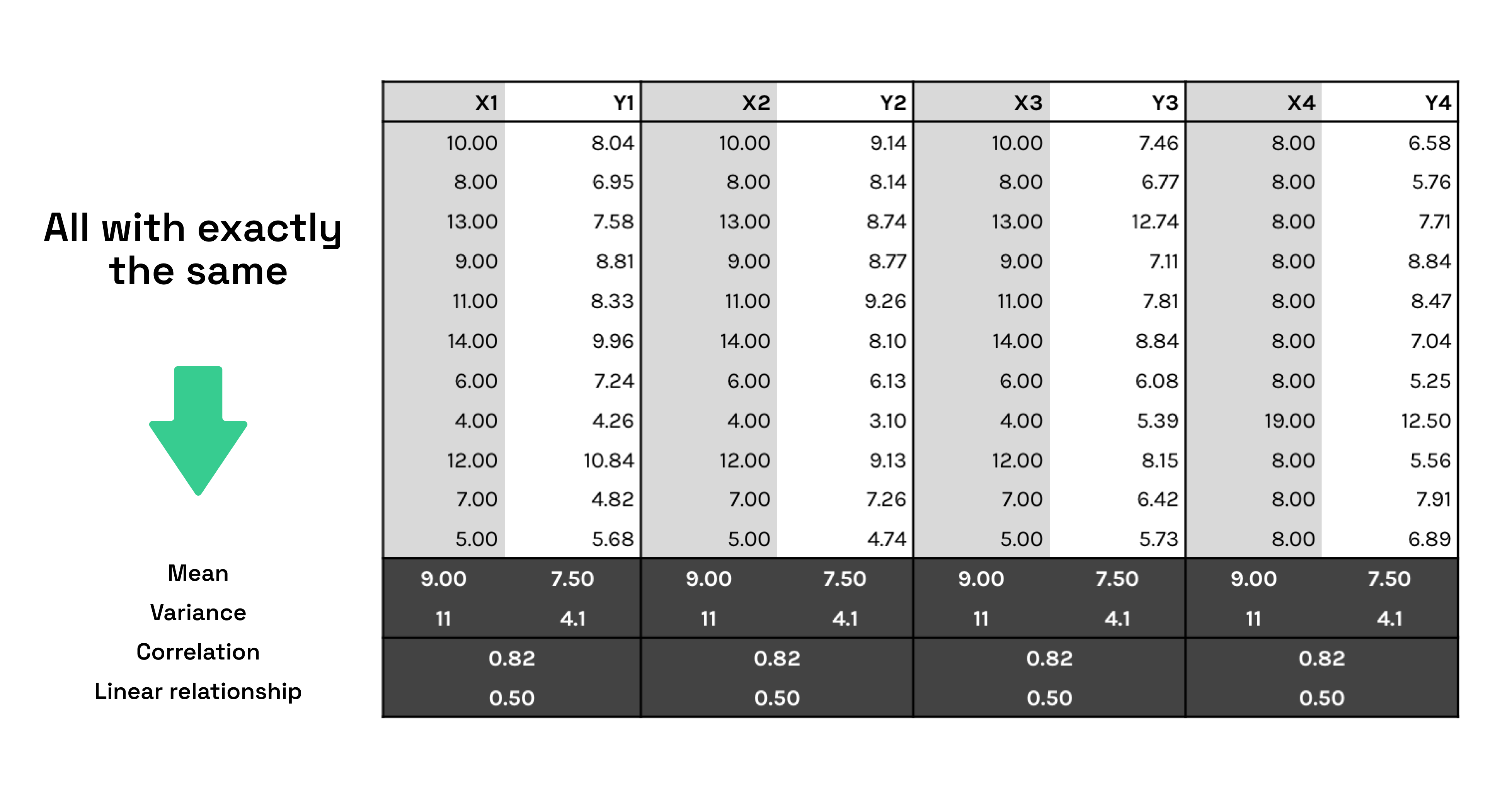
Look at this table for a few seconds.
What key information are you able to take away?
Now, look at these graphs. Same information presented in a different way.
What are you able to take away?

Selecting the right type of visualisation can make all the difference in how your information is delivered to your audience (customers, employees and other stakeholders).
Four Types of Visualisations

What are Comparison Visualisations?
A comparison visualisation makes it easy for your audience to understand and compare different data sets or objects. It can be used to easily find the highest and lowest values in the data. It can also be used to compare current values vs old, to see if the values are increasing or decreasing.
These are visualisation methods that help show the differences or similarities between values, according to Severino Ribecca's The Data Visualisation Catalog.
Examples:
Common questions: “what product sells best?” or “how do our sales compare to this time last year?”
What are Part-To-A-Whole or Composition Visualisations?
Composition charts are used to see how a part compares to the whole and how a total value can be divided into shares. A composition chart will show the relative value, but some charts can also be used to show the absolute difference.
The difference is between looking at percentage of total and value of total.
Examples:
Common questions: “how big is our part of the market in a particular region?” or “what areas is our budget divided into?”
What are Distribution Visualisations?
Distribution charts are used to see how quantitative values are distributed along an axis from lowest to highest. Looking at the shape of the data a user can identify characteristics such as the range of values, central tendency, shape and outliers. These methods display frequency, how data spread out over an interval or is grouped.
Examples:
Common questions: “what is the number of customers per age group?” or “how many days’ late are our payments?”
What are Relationship Visualisations?
Relationship charts are used to see the relationship between the data and can be used to find correlations, outliers and clusters of data. These methods show connections between the data.
Examples:
Common questions: “is there a correlation between advertising spend and sales for our products?” or “how do expenses and income vary per region, and what’s the deviation?”
> Read more on the blog: "Data Visualisation: Why you need it"
> Questions about how we can help with your data strategy? Book in a call with our managing director, Alex Avery or read more about the Notitia Team.
About Alex Avery, Notitia Managing Director + Founder

Alex Avery, Notitia Founder and Managing Director, heads our operations in Melbourne to provide data analytics and digital transformation services to more than 60 clients across Australia.
He is highly regarded for his ability to quickly analyse complex operational scenarios and provide workable solutions to achieve business objectives. This, along with considerable experience in the management of technical and business teams across both project environments and "business as usual" is the reason why most clients have come via word of mouth.
Having spent close to a decade working across Australian and global startups, Big 4 consulting and academia, Alex launched Notitia in 2019, which has since skyrocketed in growth.
Today, Alex leads his expanding team across data + analytics, design + development + strategy to help Australian clients solve their data challenges.
He sees technology as an enabler and partners with the biggest vendors to utilise best of breed software.
With the right technology and expertise, Alex says that problems of any size can be solved through valuable insights from accurate data.
Book a chat with Alex to find out how he can solve your data challenge.
