

What is data visualisation & why you should use it
Data visualisation is the place that Notitia’s Data Analytics Lead, Lachlan Hamilton, often starts, when he runs Notitia’s in-person client training for beginners data analytics and data literacy programs.
Why? Lachlan says that it’s crucial for businesses who use + communicate with data to understand the importance of presenting information in different ways.
And their people need to be trained and given access to the right tools.
Data Visualisation (DataVis): What is it?
Data Visualisation (datavis) = graphics, infographics, charts, graphs, plots. Lachlan says it’s the visual representation of data relationships and data-driven insights - presented in a way that is easily communicated, understood and (more) exciting for people to consume.
“Data visualisation is the art and science of communicating information,” Lachlan says.
“Your audience will take different meanings from the data, based on how you present it visually.
“It’s a form of storytelling, which guides the user to make a rapid decision via abstracting raw information into imagery.”
You use data visualisation to get your point across - to convey an idea/concept/insight to somebody.
- Your point can be simple: “arrivals went up”
- Or can it be nuanced: “arrivals in triage category x, with condition y increased by n%, which is z% above the year on year average”
Why should I use Data Visualisation?
Heard this before?
- Excel and tables are all I need!
- Nothing better than a pivot table anyway!
- Execs will just call/email me for the results
- My data isn’t suited to visualising
Let’s give you a few visual examples that show why the above statements are incorrect.
1. Look at the below table for 5 seconds.
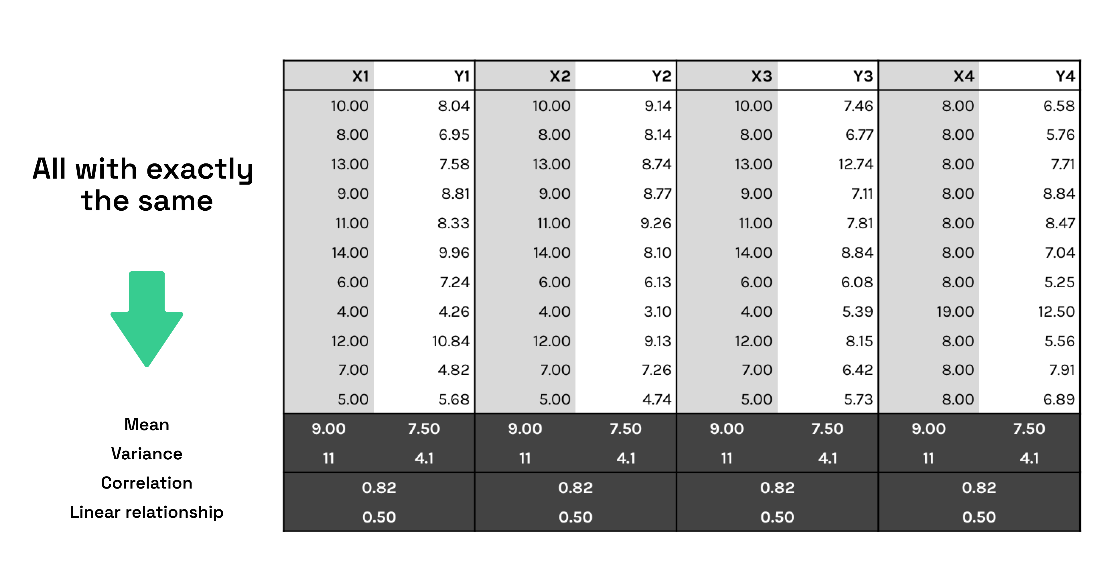
2. What information did you take away?
3. Now, look at the graphs below for 5 seconds (same information presented differently).

4. What information did you take away?
5. Moving onto the next example, here's some caseload data by site.

6. And now, here’s some caseload data by site - mapped.

7. Here’s some data about water pumps.

8. Here’s some data about water pumps - mapped. To tell the whole story, sometimes combining data is required.

About Lachlan Hamilton, Notitia Analytics Lead

Notitia’s Analytics Lead, Lachy, works closely with our clients to help them to get the most value out of their analytics projects.
His passion for using data to improve healthcare is based on his years of experience as a health data specialist and undergrad degree in biomedicine, majoring in bioengineering systems.
Lachy says he “fell” into data analytics six years ago + never left! He has delivered projects across QlikView > Qlik Sense > Qlik Cloud > Power BI. And works works mostly with Primary Health Networks (PHNs) automating reporting, building dashboards + data models. Read more here.
> Book time in with Lachlan to find out how he can help solve your problems through data.
> Need to improve data literacy in your business or upskill your people in new software + technology? Lachlan is available for on-site training with your team or a bespoke data visualisation course.
> Questions about how we can help with your data strategy? Book in a call with our managing director, Alex Avery or read more about the Notitia Team.
